Thursday, December 10, 2009

Trials of tags on product


Shortlisted options


Shortlisted options of the visiting cards in one colour and two colours. Design for the tags also tried. Tags tell the story of Arzoo on one side and the address on the other side.

Screen printing


Close up of the screen printed identities

Two colour visiting cards. With the 'sun' big in cartridge and natural shade papers.

Other options

Wednesday, December 9, 2009

Screen Printing and testing

It was important to screen print the identities on various papers and test the legibility and readability of the letters and the clarity of the elements of the identity in various sizes. As Arzoo's greeting cards and folders communicate through screen printed designs, this test became important to compare the differences between the existing identity and the refined identity. I chose handmade papers of various colours from which Arzoo make greeting cards and files and get screen printed. I also had selected Natural shade papers of 70 gsm, 80 gsm, and 100 gsm , art papers and cartridge papers. I selected three options of the identities, the existing identity, refined identity with a bigger sun and smaller sun. All three options were screen printed in 1 inch and half and inch.
While screen printing the considerations were,
1. To check the legibility and readability of the refined identity and compare it with the existing identity.
2. To check the visibility and clarity of the elements of the existing identity and the refined identity.
3. To check the identities on light coloured and dark coloured backgrounds and on white surface.

Even though I couldn't try all the possible options I managed to get the basic identity screen printed with the help of Sudarshan bai, Sirish bai, Manilal bai and Barat patel. The printing was done in NID's own printing department.


Single colour application on Handmade paper, art paper and cartridge paper and natural shade papers.


Visiting cards screen printed in different papers to test the readability of the fonts.


Visiting cards with one side telling the story of Arzoo, which will become a communication medium. Single colour application on white background. Tried on various papers.

Two colour screen printing in different papers.


Tuesday, December 8, 2009

Discussion with Arzoo and refinements

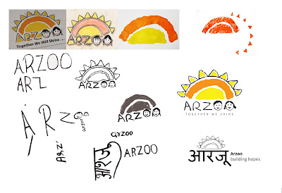
Once the final identity and the two options of the brochures were designed I had a discussion with Arzoo, which made me look at the designs more critically. From these discussions with Sulekha, Nishant and my guide Tarun Deep Girdher, I realised as a rooted organisation how much Arzoo valued and wanted to stick to the feel of the children's handwriting in the existing identity, which was missing in my design. So I had gone through another set of refinements on the identity keeping the feel of children's handwriting and refining the children's faces look less vector and more lively as a child's drawing. During the refinement I tried to give more similarity to the existing identity. Also tried to give variations of identities with the element of 'sun' bigger and smaller.

Tuesday, November 10, 2009

Friday, November 6, 2009

Short listed option: 2


The concept of brochure which can be mailed to people and supporters and clients if necessary, reducing the cost of envelope. The printing considered for both the shortlisted concepts was four colour offset. Papers considered was natural shade 100 gsm, 80 gsm and 145 gsm.

Shortlisted option: 1


The concept combining brochure and poster in one. Focused on the education of children and show the dream and aspiration of a child through his/her drawing and handwriting.

Other trials


Some other trials


Conceptualisation for the brochure


Once the identity was refined, i had to conceptualize the ideas for the brochure. The trials were considering the maximum utilization of the paper without having wastage as well as the possibility of printing methods which can be applied.

One concept was to give importance to children's drawings. The continuity was considered as the visual language which gives a story telling effect. Another concept was considering the communication of the children, activities including the product catalouge, focusing the stories of children and women of Arzoo. The idea was to tell the stories through their dialoge using speech bubbles.

Final identity and refinement


Five colour variations are given to the final identity by keeping the yellow constant always. So there is a flexibility of choosing colours in different places. It will add to Arzoo’s value as well as give vibrancy to the identity.

Thought

“Designing a logo is perhaps one of the most daunting assignments for any designer—it requires patience, craft, precision and imagination. On face value it may seem simple – but if you think about it, a logo is an attempt to distill all that a company or a brand represents into a single emblem of identity.”

Dan Olsen, Creative Director at Duffy & Partners

Thursday, November 5, 2009

Intial stages of the refinement


The entire identity had refined through stage by stage in form, typography and colours by considering it’s application levels and various printing process. The images of the process has given above.

After the break- Refining the identity


Actually it was not a break, i have been working on it and other projects came in between. But It took some time to come back to blogging.
When coming back to the project,
Rather than creating a new identity i tried modifying the existing identity by removing the unwanted and complicated elements. Tried to give teared paper effect by actual papers to get the feel of Arzoo’s activities on paper. Tried making the strokes simpler so that in all the printing process and in small sizes the identity will remain consistently. Tried using Hindi fonts considering the vernacular language. Made children write the letters in capital and small letters to find out which will work better to give the feel to the identity. Tried same colour options as well as different colours without loosing the meaning.

Wednesday, May 13, 2009

Another important meeting with Tarun

After the analysis of the logo from the typography, form and visual point of view and trying to make it proper I had another meeting with Tarun, which was really helpful, motivating and inspiring for me to look back to the work I have done so far and realize what are the points which I have missed and would be really useful in the project. These are some sparks I got from today’s discussion,
1. The identity ‘Arzoo’ which is actually a Hindi word, will it make a difference in the viewer when he read the identity in English as well as in a vernacular language?
2. What is each element says in the identity? Does it carry any meaning? Say, the 8 rays of the sun which is there in the identity. Can it be more meaningful?
3. What are the various ways of making the identity more flexible for variety of applications by keeping the consistency? ( As Arzoo does more flexible and vibrant activities)
4. What are the direct/ metaphorical/ aspirational approaches you can have in your visuals and thoughts for the promotion?
5. Can the tagline ‘Together we shine’ be changed and make more meaningful to represent Arzoo’s vision?
After the meeting I realized that I still have a long way to go and try more variations in the identity in such a way that all the elements in the identity can be properly seen in various sizes and applications.

Monday, April 27, 2009

Whom to communicate.

When analyzing arzoo’s system it is clear that,
In organizational level,
Arzoo needs more funding in order to keep their financial stability.
Order for the products are not consistent. As products stands as the mains source of income, they need to get more orders. So that they need proper communication to the suppliers and for the possible new market.
In product level,
Products are sold in the market, but it doesn’t focus on any particular group, and no unified promotional materials and doesn’t reflect Arzoo’s values. And doesn’t say anything about what is Arzoo and what it does.
There are some miscommunication about the products that needs to be cleared.

So the the areas where the communication is possible are,
1. Communication to supporters
2. Communication to the already existing clients.
3. Communication to the public.
4. Communication to the share holders

Observational analysis of the current use of identity- visual, typography and composition.


As per the observations from the initial research it was clear that to make the visual identity more clear and strong enough was important for Arzoo to make an impact in the market. Here the analysis of the identity in more details, in typography, images and composition.

Arzoo- Key words to communicate

Education
culture
income
hope
livelyhood
hobby center
handmade
development
family
discipline
children
community
harmony
lively
happiness
togetherness

play
activities
products
dreams
society
value building
simplicity
celebration
independent
dance
music
sharing

ARZOO- MISSION, VISION

ARZOO'S MISSION

Arzoo sees itself as a bridge among children of different communities which is built on the strong pillars of education and cultural interaction. Arzoo hopes that through education, children can be given a future that does not see them as prisoners of caste and religion. Alongside, Arzoo tries to work on the skills of young women from underprivileged background to make them economically self-reliant and confident of fighting for their rights.

ARZOO'S VISION

Arzoo's vision is about a bright future with communal harmony and happiness among everyone. And that vision becomes Arzoo's tag line, "together we shine"

Comparative Analysis - competitors


when starting with analysis of the data i collected first becomes the comparative study of the competitive organizations of Arzoo. I selected the organizations on the basis of products which is in the market as well as the organizations who do similar work like Arzoo. i haven't included some of the organizations who does similar vision and mission like Arzoo but doesn't involve making of products and their marketing in the system.

Opinions from Public.

Before talking about anything more I would like to add some responses and opinions from common man who bought Arzoo’s products. I could find some information about what made them support Arzoo and buy their products and what they had to say about it.
“The products are good, innovative. It shows the kind of efforts kids put to make them. The designs are also real, not the kind that are usually found in the market, so that makes them different from other counterparts”- Sejal, Software engineer.
“needs design support. the use of the kind of material is high appreciable, but there needs to be design support to make these products attractive, quality finish and in sink with the current market demands”- Aruna Pandey, Consultant - Environment and Development
“Its purely for the consideration of Arzoo kids and their future. I never saw/expected anything on the products; I am expecting the great future ahead for the kids.” - Civil Engineer
“Arzoo's products go beyond costs and beauty.. Its the innocence of the young hands that goes into making these products so appealing” - Advertising and Outreach Manager at a micro finance consultancy
“Arzoo is a great initiative to educate slum children without much of resource. They sustain themselves by producing Eco friendly and attractive products” - National Head - IT
“Arzoo is a great effort. And its products are really appreciable as those who made these products are neither professional more trained. So i wish to by so this way i can help them in tiny extent.” Quality analyst in IT
“Good effort but still can be improved specially finishing and consistency can be worked upon.”- Freelance worker
When I conclude these surveys,
1. It was interesting that most of them came to know about Arzoo from their friends as well as colleagues.
2. Functionality and aesthetics of the products as well as generosity towards Arzoo made them buy the products.
3. Some people think that the products are made by children. And in the promotional materials it is not showing these are made by women and it is used of children’s education. That leads to miscommunication.

Thursday, April 9, 2009

Arzoo+ Me > hypothesis


A hour glass model which helped me to Analise where i stand now in my project and where do i position myself in the cycle of Aroo and me.

Children- the meaning of Arzoo.


Aroo kids, the most important part of Arzoo, for whom it started and built up gradually.
Around 60 children who are below poverty line from 5-15 age group getting basic education from Arzoo. I have been observing them from the beginning of my research. I could see the energy and enthusiasm of the children who is never exposed to a multimedia world like ours. Getting inspired from the discussion with Prof. Anil Gupta, I thought of having an interaction section with the kids. I could make them draw about their dreams..about themselves…about arzoo. The observations I could gather from these are,
1. They are dreaming about a bright future in which they, their friends and family and country can live happily.
2. Children like to come to Arzoo because, Arzoo provide them an education with so much of fun and they get to see a lot of places, lots of new things.
3. Each kid carry a wonderful memory with them about each celebration. About the cartoon shows, about the gifts they got.. about the cultural programs they participated.
The boy, Sarfaraz, his most memorable experience in Arzoo was the character he acted in a play ‘ I am like you’..
I think these experiences and understandings will help me to look in to their identity more critically and later in creating a visual language for Arzoo.