Tuesday, November 10, 2009

Friday, November 6, 2009

Short listed option: 2


The concept of brochure which can be mailed to people and supporters and clients if necessary, reducing the cost of envelope. The printing considered for both the shortlisted concepts was four colour offset. Papers considered was natural shade 100 gsm, 80 gsm and 145 gsm.

Shortlisted option: 1


The concept combining brochure and poster in one. Focused on the education of children and show the dream and aspiration of a child through his/her drawing and handwriting.

Other trials


Some other trials


Conceptualisation for the brochure


Once the identity was refined, i had to conceptualize the ideas for the brochure. The trials were considering the maximum utilization of the paper without having wastage as well as the possibility of printing methods which can be applied.

One concept was to give importance to children's drawings. The continuity was considered as the visual language which gives a story telling effect. Another concept was considering the communication of the children, activities including the product catalouge, focusing the stories of children and women of Arzoo. The idea was to tell the stories through their dialoge using speech bubbles.

Final identity and refinement


Five colour variations are given to the final identity by keeping the yellow constant always. So there is a flexibility of choosing colours in different places. It will add to Arzoo’s value as well as give vibrancy to the identity.

Thought

“Designing a logo is perhaps one of the most daunting assignments for any designer—it requires patience, craft, precision and imagination. On face value it may seem simple – but if you think about it, a logo is an attempt to distill all that a company or a brand represents into a single emblem of identity.”

Dan Olsen, Creative Director at Duffy & Partners

Thursday, November 5, 2009

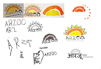
Intial stages of the refinement


The entire identity had refined through stage by stage in form, typography and colours by considering it’s application levels and various printing process. The images of the process has given above.

After the break- Refining the identity


Actually it was not a break, i have been working on it and other projects came in between. But It took some time to come back to blogging.
When coming back to the project,
Rather than creating a new identity i tried modifying the existing identity by removing the unwanted and complicated elements. Tried to give teared paper effect by actual papers to get the feel of Arzoo’s activities on paper. Tried making the strokes simpler so that in all the printing process and in small sizes the identity will remain consistently. Tried using Hindi fonts considering the vernacular language. Made children write the letters in capital and small letters to find out which will work better to give the feel to the identity. Tried same colour options as well as different colours without loosing the meaning.